Your Website Might Be Ugly—But Don’t Worry, We Can Test That
“If you’re not testing, you’re guessing—and guesswork doesn’t pay the bills.”
7/11/20253 min read
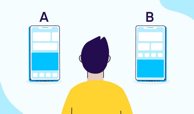
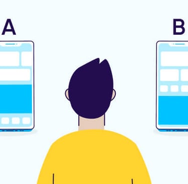
A/B testing is basically your website’s glow-up trial. You take two versions of a page—Version A (your current one) and Version B (the spicy remix)—and send them to different audiences to see which one performs better. More clicks? More time spent? More add-to-carts? That’s your winner, baby.
Why should you care? Because you’re probably leaving money on the table. One tiny change in your layout—like moving a button, changing the CTA text, or swapping out an image—could literally double your conversions. And unless you’re cool with guessing your way through web design, testing is your new BFF.
Small Tweaks, Big Results
You don’t need to blow up your entire website to run a meaningful test. In fact, the best A/B tests are often about the small stuff: headline tweaks, button colors, form length, image placement, etc. These are the micro-decisions users don’t even realize they’re reacting to—but their behavior changes big-time.
Testing layout options also reveals what actually matters to your visitors. Maybe they prefer a clean, minimal design over your rainbow-colored chaos. Or maybe that long scroll page you love is secretly exhausting them. A/B testing shines a light on what clicks and what causes people to bounce faster than bad Wi-Fi.
Did you know?
A/B testing can boost conversion rates by up to 300% when used effectively!
Layout vs. Design: Yes, There’s a Difference
People often lump layout and design into the same bucket, but they’re different beasts. Layout is structure—where things go, how users navigate, the flow. Design is the look—colors, fonts, aesthetics. A/B testing works best when you treat these as separate variables and test them individually before mixing and matching.
Let’s say you're testing a homepage. Version A uses a classic top-down product showcase, while Version B goes with a grid layout. Same content, different flow. That’s layout testing. Then you run a new test—keeping the layout but switching colors, typography, and imagery. That’s design testing. Run them separately, then combine your top performers. Boom: hybrid perfection.
Don’t Trust Your Gut—Trust the Data
Your designer might say, “This looks better.” Your gut might say, “This feels right.” But your users might say, “Nah, I’m out.” That’s why A/B testing matters. You’re not building for yourself—you’re building for your audience. And they vote with their clicks (or lack thereof).
Every element on your site is a chance to win or lose attention. And attention is currency. A/B testing lets you measure what actually grabs it. Headlines, hero images, testimonials, even font sizes—don’t leave them to opinion. Leave them to cold, hard numbers. Spoiler: the numbers never lie.
Timing Is Everything—So Is Traffic
Running an A/B test without enough traffic is like trying to judge a talent show with only two contestants. You need volume for your data to mean anything. Most experts recommend at least 1,000 unique visitors per variation for statistically significant results. Otherwise, you’re just guessing in a slightly more technical way.
Also, don’t cut the test short. We get it—you want answers fast. But patience = power. Give your test at least a week or two (or more, depending on traffic). Monitor the data daily, but don’t declare a winner until the dust settles. Rushing a test is like pulling a cake out of the oven halfway through—it looks fine on top, but it’s a hot mess underneath.
What Should You Test First?
The million-dollar question. Start with your highest-traffic pages or most valuable conversions. That could be your homepage, product category pages, lead-gen forms, or checkout flows. If a page gets lots of eyes or leads directly to money—it’s a prime testing candidate.
And keep it simple. Don’t test 15 things at once or you won’t know what caused the change. Test headlines one week, layout the next, then button color after that. This gives you clean, isolated results. It’s not about being fast—it’s about being smart. Test small, win big.
Quick Insight:
Only 22% of businesses are satisfied with their conversion rates!
At Glory Media, We Don’t Just Test Layouts. We Roast the Losers and Crown the Converters.
We treat A/B testing like a reality show. Two layouts enter. One layout wins. The other? Eliminated with dramatic music. At Glory Media, we don’t settle for “meh, this might work.” We obsess over what actually works. And we test it, tweak it, and test it again until your website becomes a lean, mean, money-making machine.
Whether it's a headline swap, a full design overhaul, or a button that screams “Click me like you mean it,” we bring the science and the sass. We run your tests, interpret the data, and build you a layout so good it might just wink at your users.
Want a site that doesn’t guess—but converts like crazy?
Book your FREE discovery call today—and let’s turn your pages into powerhouses.