Smooth Sailing: How to Improve Website Navigation for Effortless User Exploration
A great website doesn’t make users think — it guides them intuitively.
7/4/20254 min read
When visitors arrive on your website, they do so with specific goals in mind, whether that is to learn about your services, make a purchase, or simply find contact information. In those critical first moments—often under a tenth of a second—they decide whether they want to invest time in exploring further. Effective navigation serves as the roadmap that guides users seamlessly through your content, products, or services, minimizing frustration and maximizing engagement. Without clear, intuitive menus and pathways, even the most compelling content can go unnoticed as users abandon the site in search of a simpler alternative.
Improving navigation is not merely an aesthetic choice but a strategic investment in your site’s performance and credibility. A confusing menu structure or buried pages cause visitors to leave, increasing bounce rates and reducing conversions. Conversely, well-crafted navigation helps users find what they need quickly, encourages them to stay longer, and increases the likelihood they will complete desired actions. By prioritizing user-friendly navigation, you are effectively reducing friction at every touchpoint, enhancing both customer satisfaction and your bottom line.
What Website Navigation Is and Why It Matters
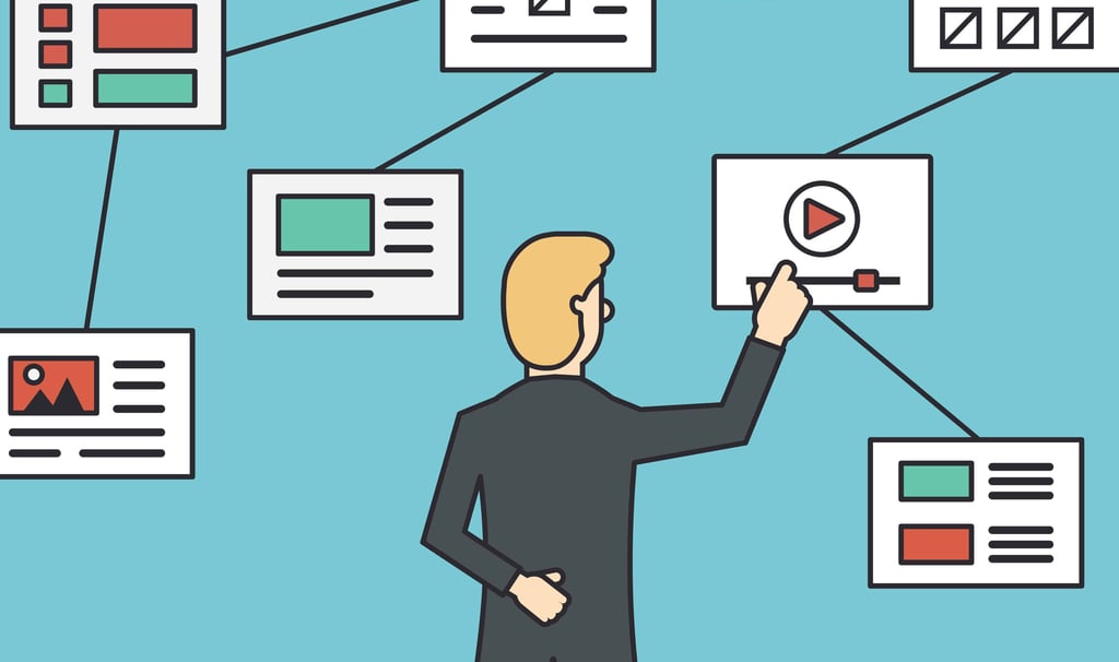
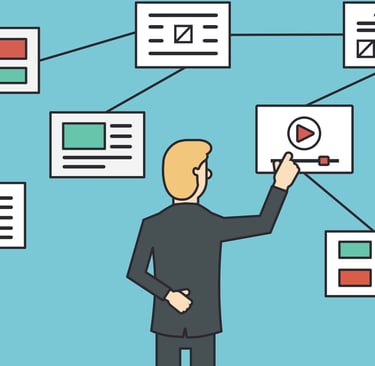
Website navigation comprises the system of menus, links, and interactive elements that allow visitors to move from one page to another with ease. It typically includes a main navigation bar—either across the top or along the side—dropdowns or mega menus for large sites, breadcrumb trails to show visitors their location, footer links for secondary pages, and a functional search bar. Each of these components plays a role in shaping the user’s journey, helping them discover your offerings and relevant information quickly without relying on guesswork or trial and error.
The importance of navigation extends beyond user convenience; it directly impacts search engine optimization, site credibility, and conversion rates. Search engines like Google crawl and index your pages more effectively when your navigation structure is logical and consistent, which can improve your rankings. Additionally, clear navigation builds trust with first-time visitors by demonstrating professionalism and transparency. Ultimately, a thoughtfully designed navigation system is foundational to both user experience and business success.
Did you know?
38% of users leave a site if they find the navigation confusing or difficult!
Common Navigation Mistakes That Hurt User Engagement
One of the most frequent errors is overloading the menu with too many options, which forces users to scan through a list and guess which link leads to the information they need. Vague labels like “Resources” or “Stuff” can leave visitors uncertain about what they will find upon clicking, increasing frustration and abandonment. Neglecting to include a prominent search bar further compounds the problem, as users cannot fallback on keyword searches when navigation fails them.
Another mistake is failing to maintain and test links regularly, leading to broken pathways that result in error pages. Non-clickable logos or missing “Home” links can also confuse users who wish to return to the starting point. Additionally, ignoring mobile users by not optimizing the navigation for touch screens alienates a significant portion of your audience. By identifying and correcting these missteps, you can create a navigation structure that supports rather than hinders user exploration.
Real-World Example: Airbnb’s Navigation Transformation
Airbnb faced the challenge of offering a wide array of options—rentals, experiences, and online offerings—without overwhelming users. By simplifying their top navigation to just a handful of clearly labeled options, they reduced cognitive load and streamlined the booking process. The updated menu now features four primary items, each leading to focused landing pages with contextual search fields, filters, and personalized recommendations that guide visitors directly to relevant options.
This redesign improved mobile usability significantly, leading to a measurable uplift in bookings within specific markets. By removing clutter and emphasizing the core offerings, Airbnb made it easier for users to find and book stays or experiences in just a few clicks. Their success underscores the power of minimalism: a lean, purpose-driven navigation structure that prioritizes user goals can dramatically enhance both engagement and conversions.
How Navigation Influences SEO and Site Performance
Search engines reward sites with clear, logical structures because they can crawl and index pages more efficiently. A well-organized navigation system creates meaningful internal links that pass authority throughout your website, boosting the visibility of deeper pages in search results. Moreover, intuitive navigation reduces bounce rates and increases dwell time—two metrics that search algorithms use to gauge content relevance and quality. Faster, streamlined menus also contribute to quicker page renders, which further enhances SEO rankings.
By aligning your navigation with both user needs and search engine best practices, you achieve a dual benefit: improved discoverability by potential customers and stronger organic visibility in search results. This means more qualified traffic finding your site through search engines, leading to higher engagement and conversion rates. Prioritizing navigation is therefore not just a UX concern but a strategic SEO investment that pays dividends in traffic and revenue growth.
Quick Insight:
Well-structured navigation can boost page views by up to 55% and reduce bounce rates dramatically!
Why Glory Media? Because Boring Content Is So Last Season.
At Glory Media, we don’t believe in bland. We believe in bold. Your testimonials shouldn’t sound like elevator music—they should hit like a headline. We take real people, real stories, and real emotion—and wrap them into content so good, your competitors might start stalking your ads for tips. Whether it’s raw UGC or a polished production, we know how to make every word feel like it means something.
We don’t just hand you files—we hand you a weaponized content library. Ads, landing pages, socials—you name it, we’ve got testimonial gold ready to plug and play. So you’re not just collecting praise, you’re profiting from it. And yes, we’ll even make your shyest customer camera-ready like they were born for it.
Ready to turn “nice words” into next-level revenue?
Book your FREE discovery call today—and let’s make the internet obsessed with your brand.